Responsibilities
- Visual identity
- Web design
- Photography
About
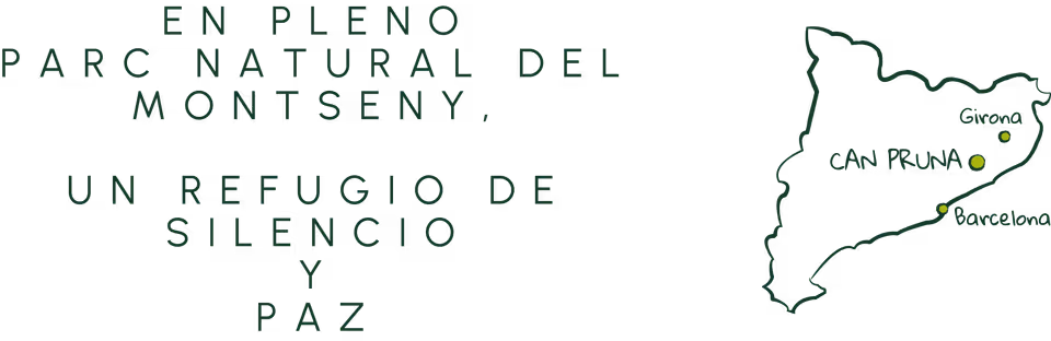
Client: Can Pruna
Sector: Hospitality & tourism
Country: Catalonia, Spain
Project
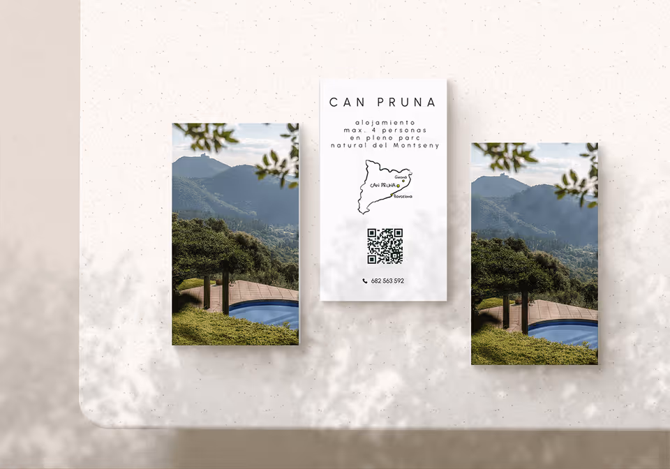
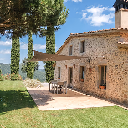
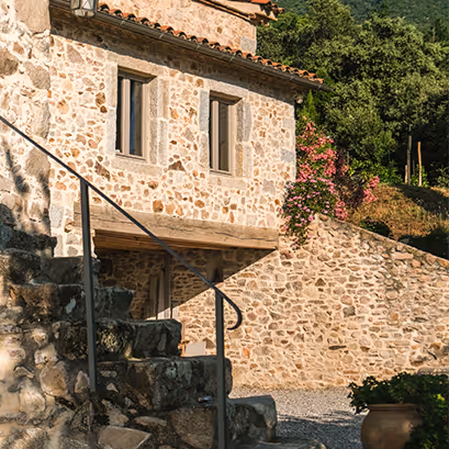
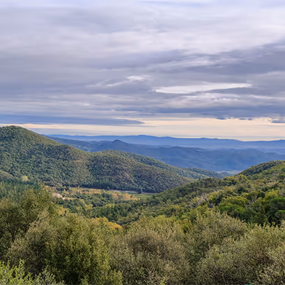
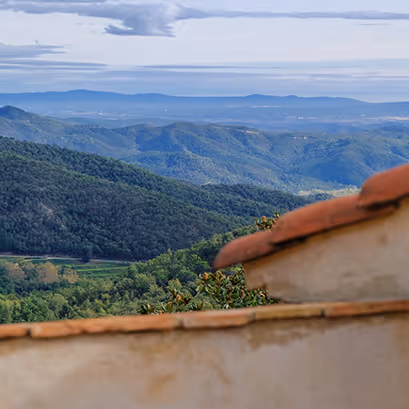
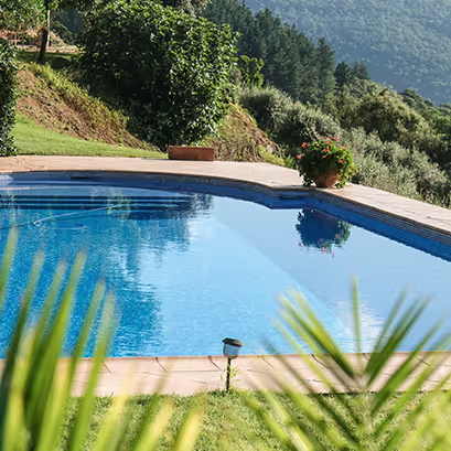
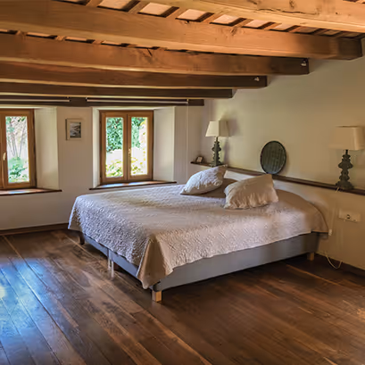
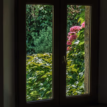
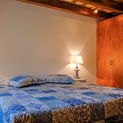
Our design distilled Can Pruna’s Masía into a cohesive visual story, anchored by an earthy palette of charcoal, off-white, bright olive, and deep forest green drawn directly from the site. Hand-sketched elements bring an artisanal touch that feels both welcoming and authentic. We paired a generously spaced sans-serif for headings with a humanist serif for body text, allowing ample white space for imagery and line art to breathe. I also photographed and retouched all site imagery, ensuring each shot reflects the Masía’s tranquil, hospitable spirit. Together, these choices create an inviting, narrative-driven interface that evokes rest and reconnection from first glance.
Branding
The Can Pruna logo features three stylized cypress trees set in subtle perspective. The trio conveys true hospitality: three trees speak to abundance and generosity, inviting visitors to join in a shared experience of rest and reconnection. In Mediterranean lore, one tree invites travelers for a drink, two promise food and drink, and three, just like here, signal full accommodation (drink, a meal, and a bed for the night). It underscores the Masía’s promise to offer not just shelter, but a gracious, inclusive welcome under the Montseny sky.